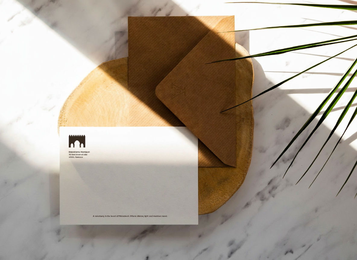
Visual Identity for Riad Aitama - Marrakesh
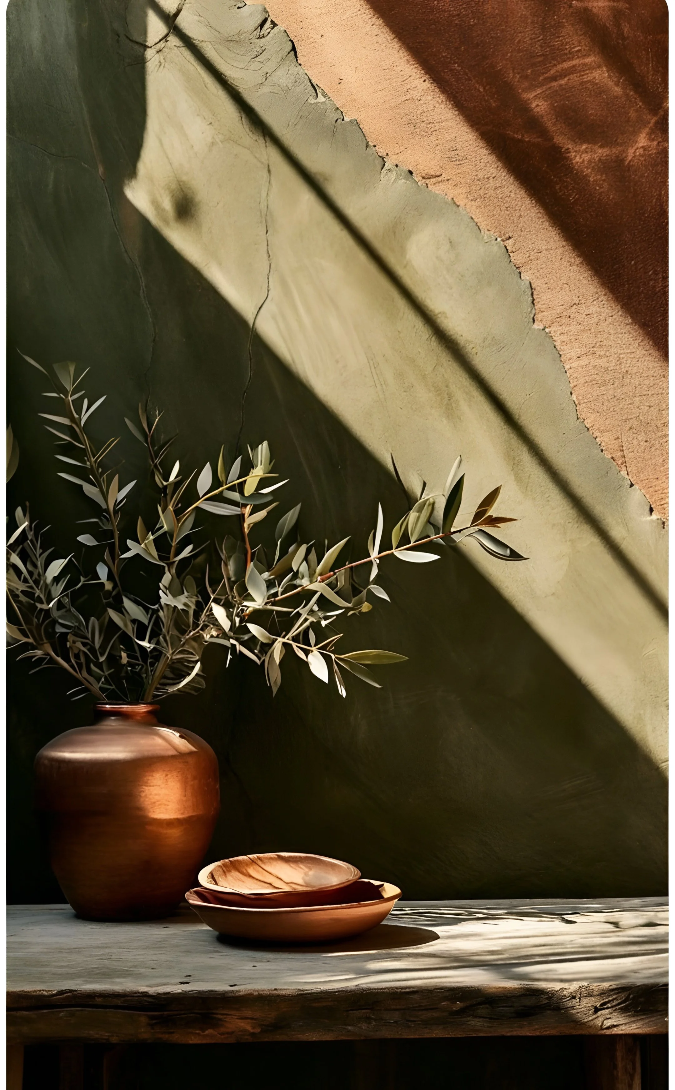
Aitama is a hotel  in Marrakech, currently in its final stage of construction. The project was developed in collaboration with the interior designer behind the space, with the goal of creating a visual identity that feels coherent with its architecture and atmosphere.
The scope focused on designing the logotype and building a visual foundation to support the brand across different applications.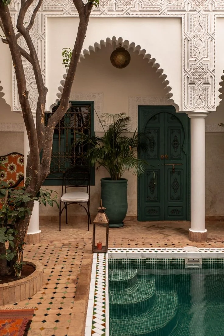
Typographical Direction
The typographic direction is inspired by traditional Basque letterforms, reinterpreted to feel both expressive and controlled. It brings a strong presence to the identity while keeping a certain level of calm and balance.Concept
The name Aitama comes from the Basque words "aita" and "ama" — father and mother — and is linked to the idea of origin, emotional connection, and roots.This way the identity focuses on building a connection between the client’s background and the physical space, allowing both to coexist naturally.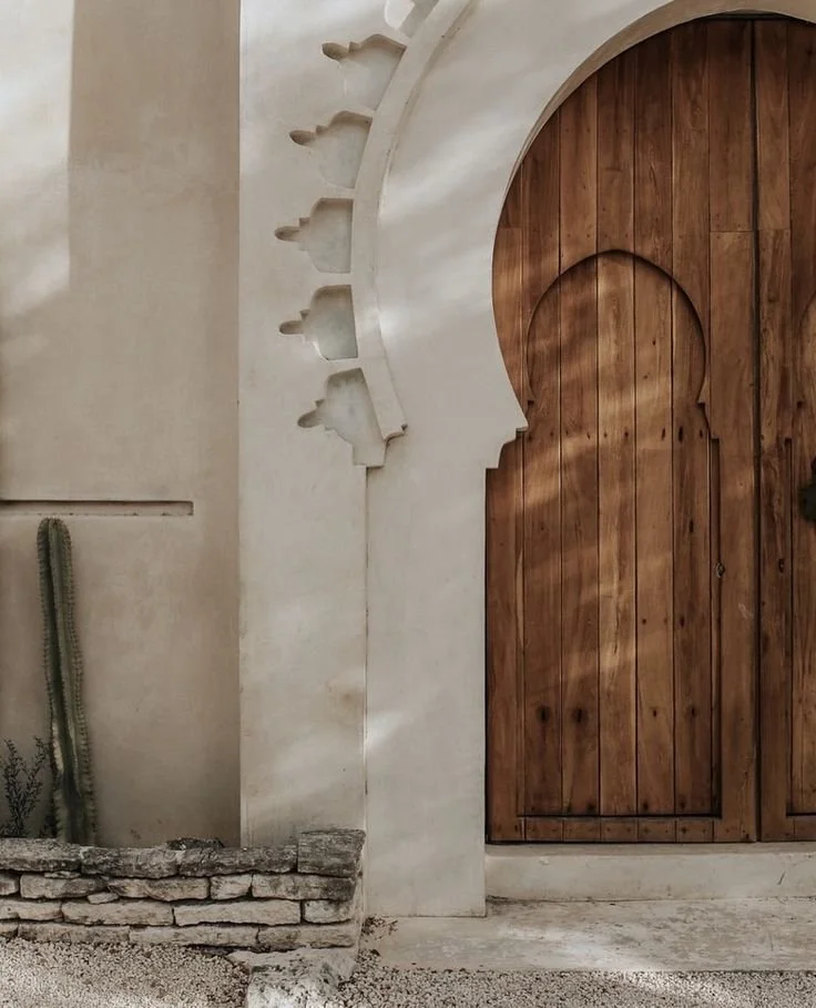
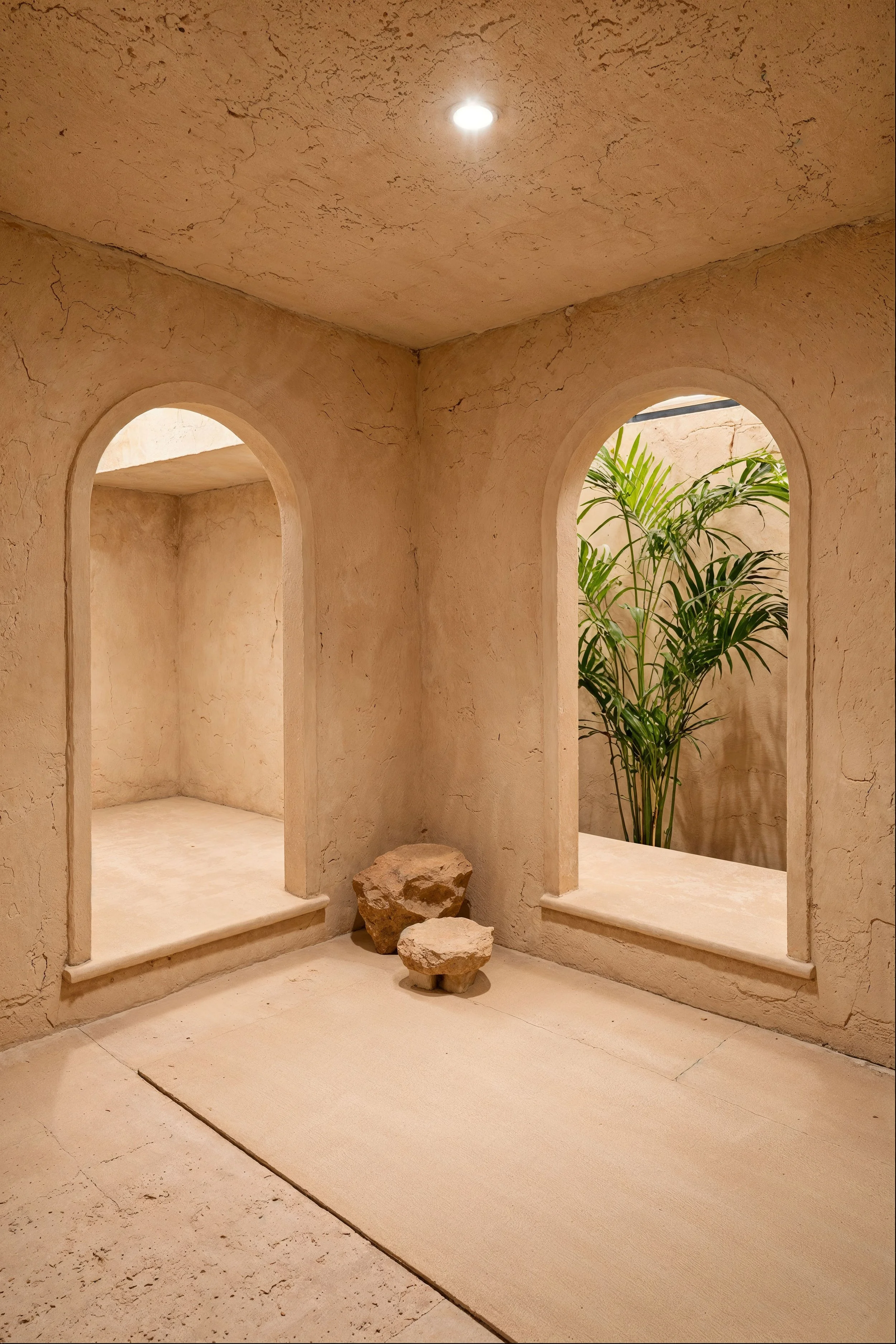
Architectural References
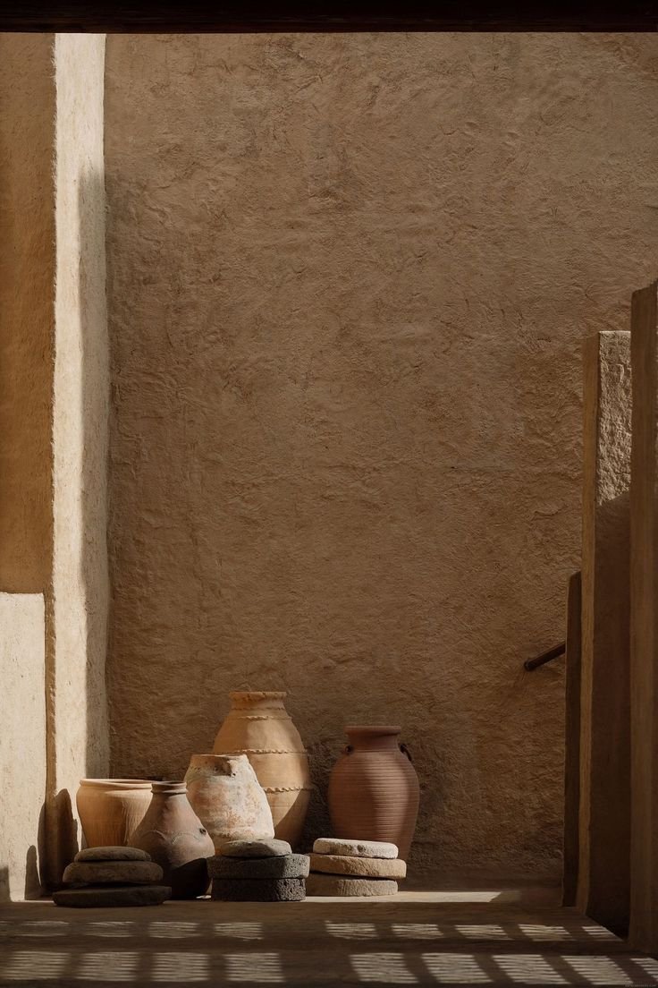
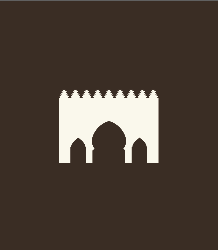
The visual language is informed by key elements from the Riad: The geometry of its arches, stepped details found in the architecture of the city and the structural references from walls and columns.All these references are translated into simple graphic forms, avoiding anything too literal while still staying connected to the space.
The process
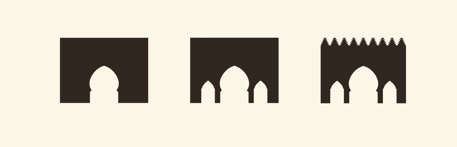
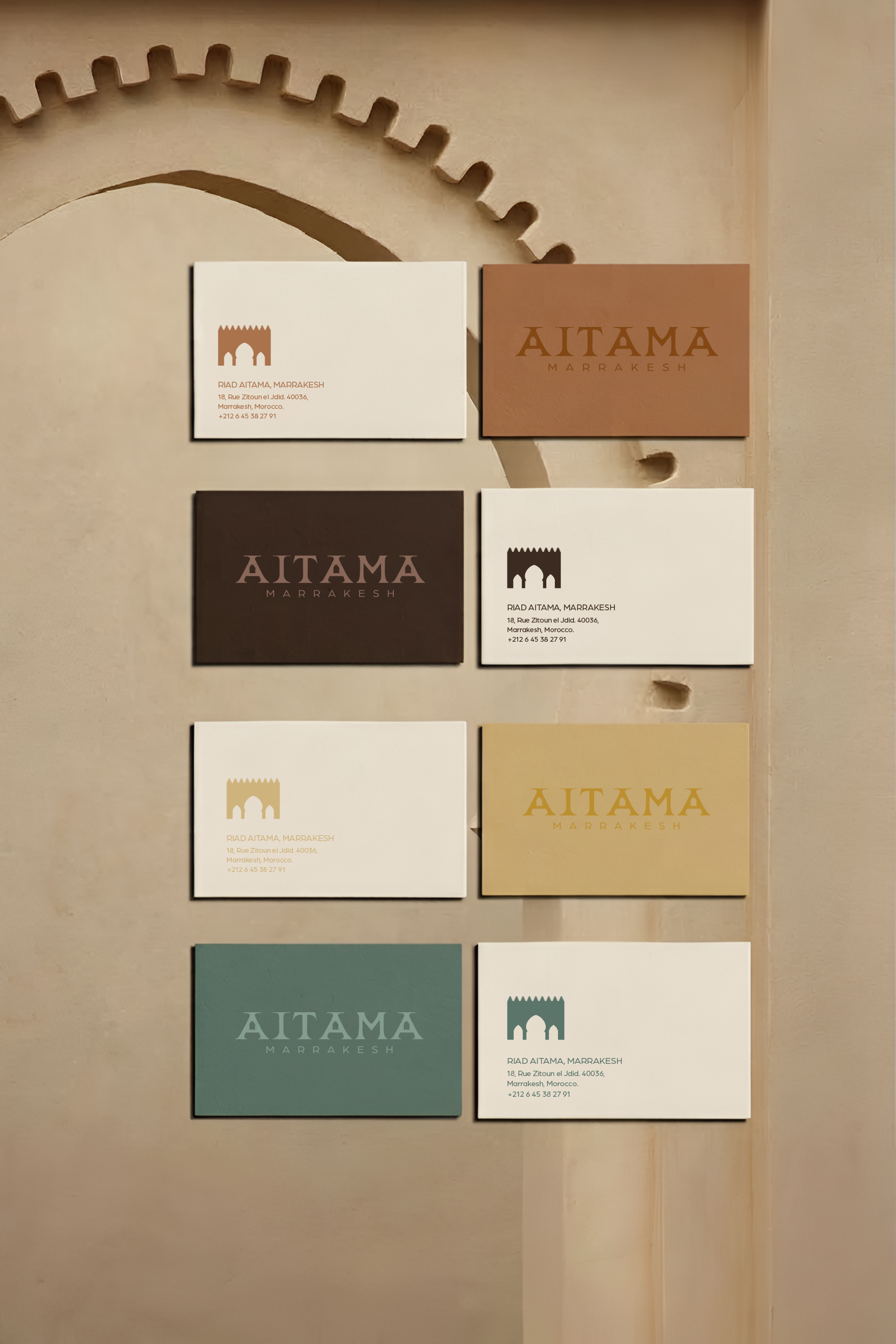
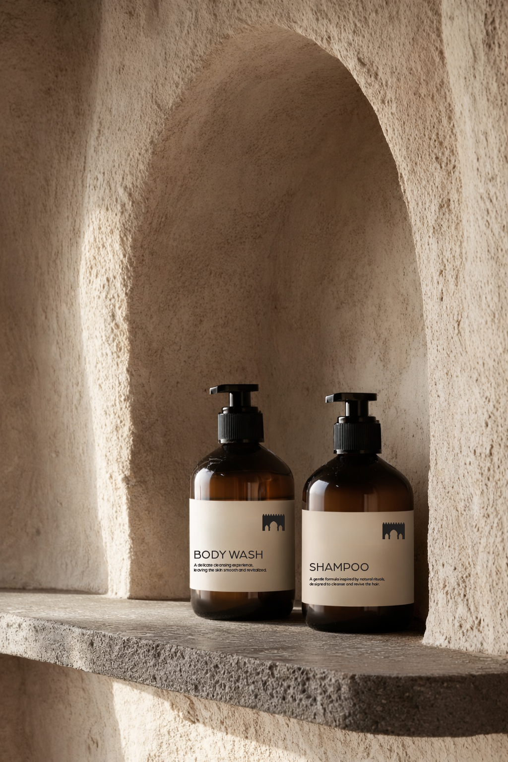
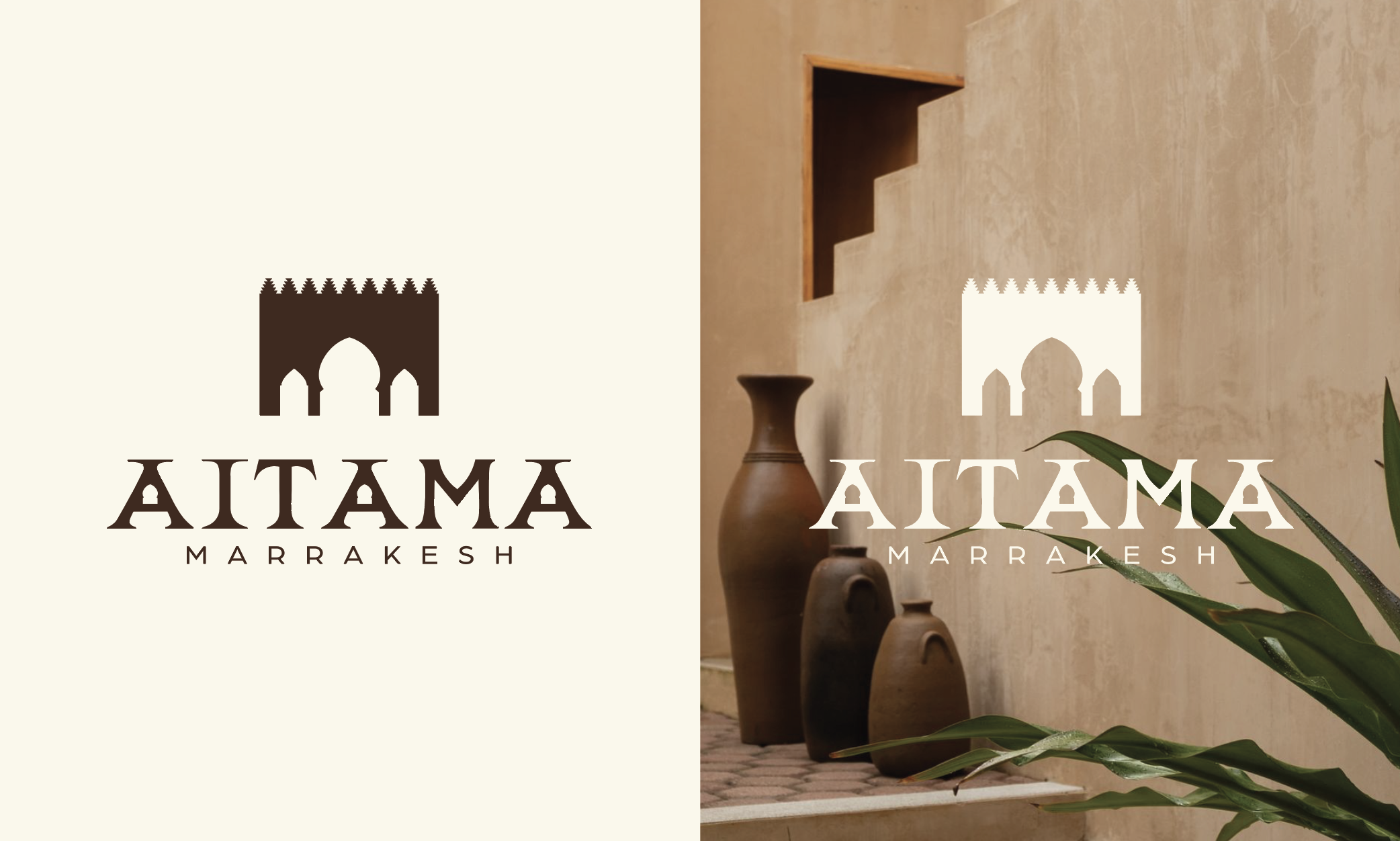
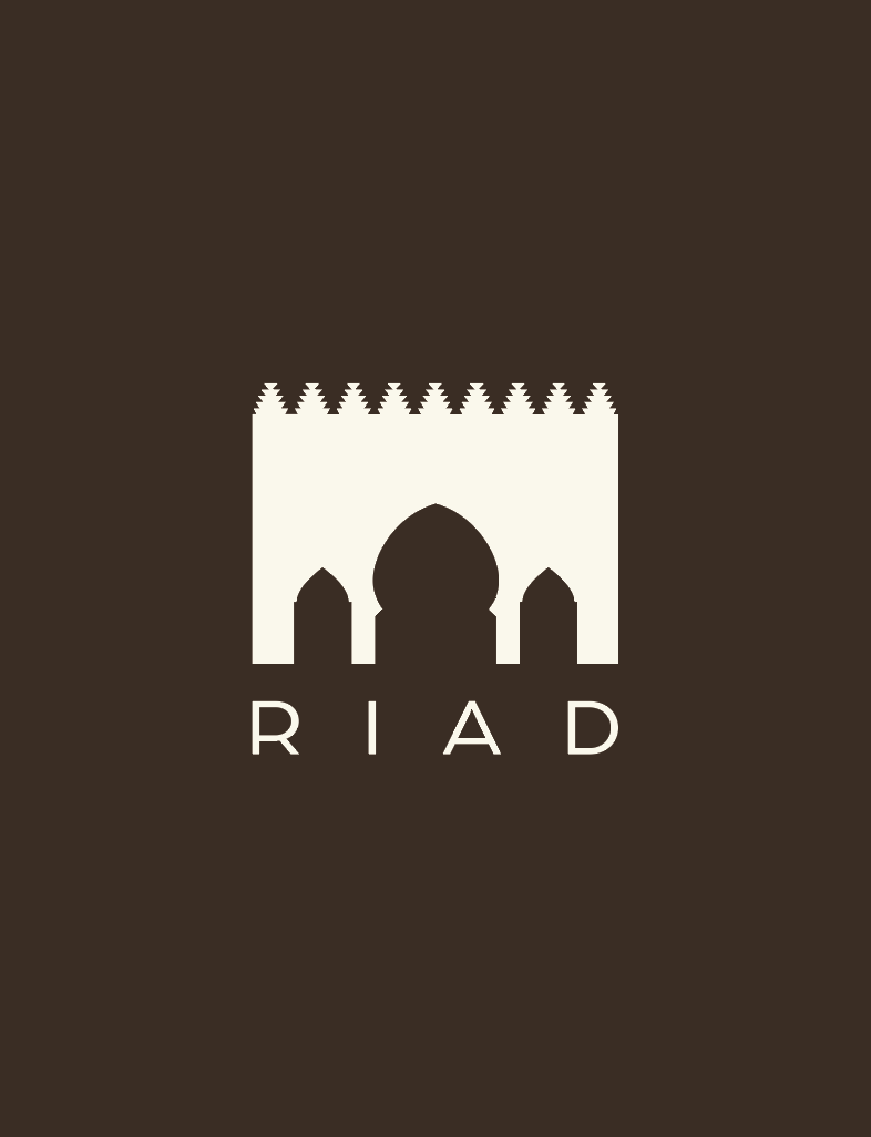
The logotype is built from the geometry of the arch of the building , incorporating stepped details as a defining element.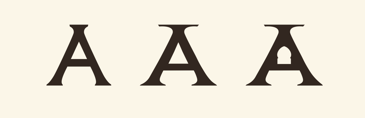
Based on the "Bilbao" typeface, the letterforms were reworked and refined before integrating the symbol into the final mark.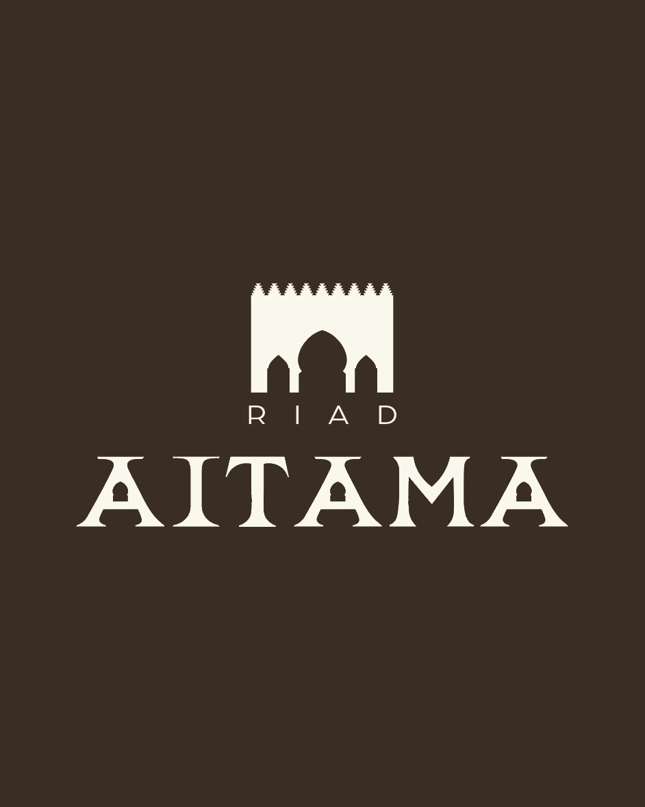
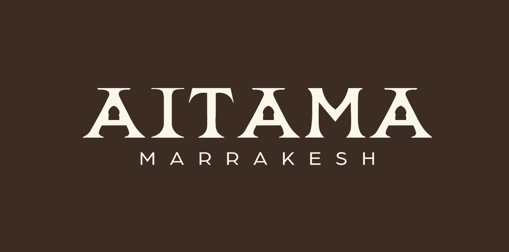
Typography
The primary typeface, Bilbao, conveys elegance and strength, reflecting the brand’s refined character. The secondary typeface, Arboria Book, provides lightness and clarity, creating a balanced contrast that complements the logo without competing with it.
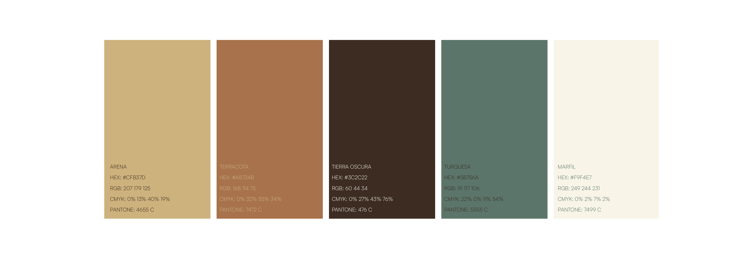
Starting from the Bilbao typeface, a process of redrawing was carried out in collaboration with the client, adapting it to his preferences. He aimed for a heavier and more pronounced expression. Later on the logotype was then completed with the integration of its symbol.Color palette